
This post was originally published as an assignment for INFO 287 Seminar in Information Science: The Hyperlinked Library at the School of Information at San José State University.
Dear Data by Giorgia Lupi & Stefanie Posavec
Dear Data is so much more than a book. It is an experience, which I explored through three different platforms. First by reading the digital ebook on my iPad, which allowed me to zoom in on tiny details of each illustration. Then with the physical book, with each 8” X 11” page, the open book layout makes for a nice large format to pour over every subtle detail of the illustrations and data legends. I learned even more about this project by exploring the website. A note to new readers wishing to learn about this project, I suggest starting with the website, which offers the most detailed information. Lupi & Posavec share their notes and observations behind each of their postcards, week by week.
Beautifully illustrated, this book offers a new way of reading. Rather than exclusively drawing meaning through the written word, Lupi & Posavec give the reader a unique and intimate view of their lives, by reading the images and deciphering the data within. This unique presentation allows the reader to rethink their relationship with written communication. Analyzing the data graphs is unexpectedly intimate. At times, this can feel somewhat voyeuristic. The book is both inwardly and outwardly reflective. Reflective in that one can see themselves in the data and stories. But it also reveals human nature and the way people interact with themselves, their friends, their lives, at work, at home, in nature, when traveling. We can see ourselves, see the similarities and differences that link us.
At first, the book appears to be light in textual content, but each postcard is rich in media and symbol-based legends. Reading it is a very contemplative and analytical activity. Sometimes their cards are very similar, and others are very different. The legends reveal complexities in the writer’s thought process which evolves as the year of cards progresses. The creators note that some weeks feel too intense or personal for them to track and record. Yet, by doing so, the user gains insight into their coping mechanisms, emerging as a therapeutic process for the authors and the reader.
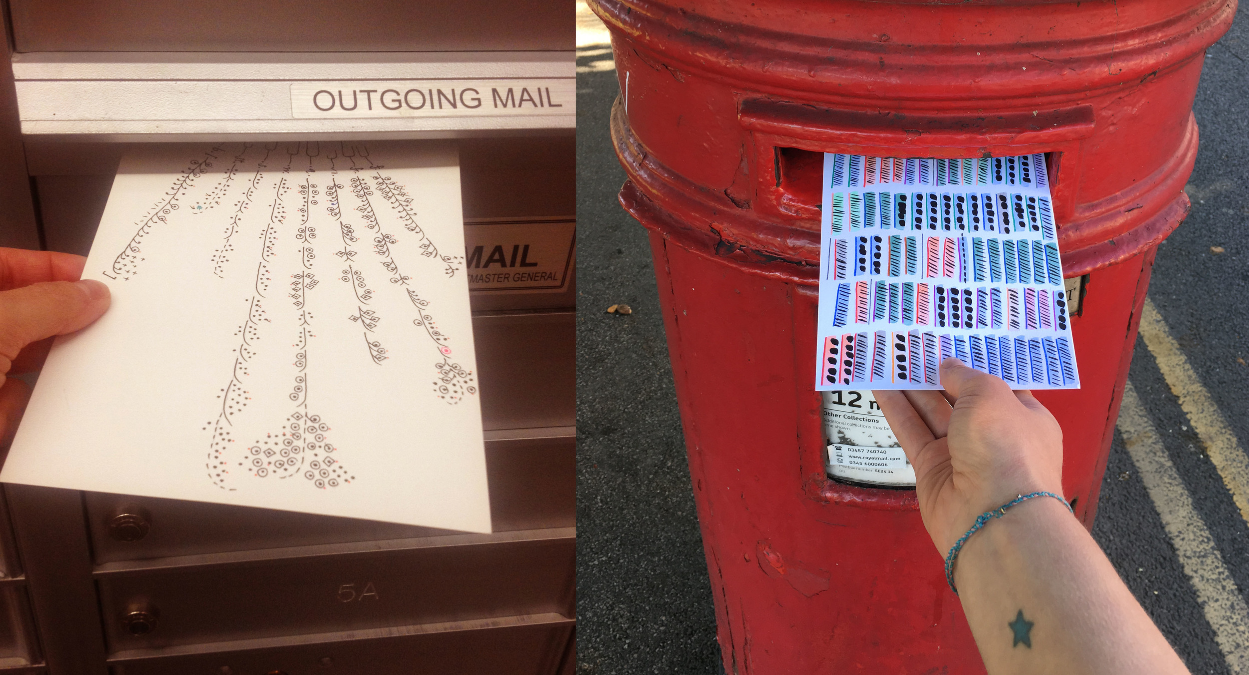
For example, I love the topic of privacy during week 51. Especially Stefanie’s version on p. 275, shown below. Here she uses black dots to conceal each data point, only letting the viewer see a hint of its meaning represented in the color-coded key on the legend.


The postcards also introduce new ways of considering how to approach the public. Through the data visualization activities, the women learned more about themselves. These visualizations provoke the reader to see how seemingly unrelated things can link up. It shows how everything is connected, revealing the relationship between sounds, the city, time, significant others, food, choices, and decisions. Sometimes the postcards resemble musical scores, abstract art, scorecards, doodles, or cryptic messages written in a hieroglyphic language.
Lupi & Posavec purposefully avoided the use of technologies to track the data, except for a few times. Noting this was a refreshing break from constantly checking their devices to feel connected to the world. This activity demonstrates how one can be even more connected by unplugging from technology to make meaningful associations with real people. The cards show how we spend our time, providing valuable insight into human behavior.
Everything can be mapped, counted, and measured. *
While reading through the book, I thought about how the authors plotted their weekly prompts onto their graphical illustrations as they went through the week, later creating the legend. However, the process is discussed at the end of the book, where I learned it was the opposite. Each card is carefully created throughout the week. On their website, you can learn more about the process. Stephanie and Giorgia share the methods they used to collect and record data, then carefully create an illustrative theme, and transfer the data to their visualizations.
Using Dear Data in the Hyperlinked Library
I’d like to think this book also introduces unique ways in which libraries and museums could evaluate the data that steers decision-making. Tracking circulation stats, or door count numbers, or the number of questions answered at the reference desk rarely paints a picture of how users are really interacting with the library. In reading Dear Data, I was flooded with ideas of how to make look at events that happen in libraries in a different way. I plotted many on this interactive dashboard and invite you to join me.
I invite you to participate with this interactive idea board.

To draw is to remember. **
* quote from p.xi. Dear Data Lupi, Giorgia & Posavec, Stefanie. (2016)
** quote from p.284. Dear Data Lupi, Giorgia & Posavec, Stefanie. (2016)